Skift Take
When it comes to designing logos, luxury brands are generally risk-averse. That's even the case in the hospitality industry, where brands are always trying to promote their singularity. The names may change, but the colors stay the same.
What is the color of luxury? If you assess the answer by looking at the logos of luxury fashion houses, the answer is literally black and white. Chanel and Prada and Dolce & Gabbana and nearly all the others sport black type against a white background.
“Black is a symbol of power. With its diametric partner in crime, white, black stands for sophistication, weight, and seriousness. Black is timeless and effortlessly stylish. Think the little black dress,” said Brian Lischer, founder and CEO of branding agency Ignyte,
However, when you look into the world of luxury hotel brands, the color palette broadens just a tad. High-end hotels that venture into the spectrum frequently use gold or blue either as an accent or as a primary color. The reason for these choices becomes apparent when one digs into the world of color analysis.
“A fundamental aspect of neurobiology is that there’s a sequence of cognition – how the brain processes information,” said Dr. Bevil Conway, a scientist at the National Eye Institute, part of the National Institutes of Health.
“Color is a primitive form of information. It’s an emotive cue, so it’s an important differentiator for brands. It signals identity; it tells people what team you are on.”
Because so many brands employ wordmarks rather than shapes and symbols, color ends up becoming the visual component people remember most about a logo.
According to countless color psychology studies, blue is frequently the most common favorite color among the world’s population, especially with men.
“This global preference and environmental omnipresence makes blue non-threatening, conservative, and traditional. Brands are not taking any risks when they call on a shade of blue for their identity,” said Lischer, “as it is seen as a sign of stability and reliability.” Hence why so many airlines and banks use it in logos.
The same goes for hospitality. “Blue has long been associated with reliability and trustworthiness. For example, blue chips are stocks you can depend on. What do we want from hotels? In part, you are trusting them with your safety,” said Conway.
Gold and silver are other colors regularly incorporated in luxury hotel brand logos.
“Hospitality brands often opt for classic colors like black, gold, and blue to create a mature, trustworthy and sophisticated impression on potential customers. Gold and silver, as the colors of precious metals, create an impression of wealth, prosperity and success that resonates well with audiences targeted by luxury brands,” said Pam Webber, chief operating officer of global creative platform 99designs.
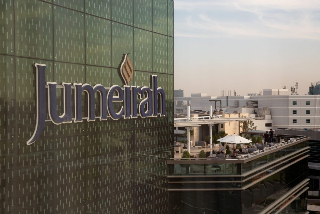
Taking a look at luxury brand logos, one discovers that Capella and Kempinski use blue. Jumeirah uses blue and gold. Gold is a component of the logos of Conrad, Viceroy, Langham, St. Regis, Mandarin Oriental and InterContinental. Silver/Gray pops up from time to time, often when logos are replicated in monochromatic ways.
It seems this type of color clustering is common among various industries. “It’s convention, doing what everyone else is doing,” said Conway. “Logos of similar industries tend to cluster. It’s not because it’s hard-wired, but we have established a convention (the use of particular colors) imbued with social meaning.”
Interestingly, there are a few outliers among the bunch. Virgin Hotels, a brand that always dares to be different, uses bright red, a color of power, passion and energy. According to digital marketing firm WebFX, “A red logo shows that your brand is powerful and high-energy.”
“Virgin, with its unique and immediately identifiable shade of red, is a perfect example of this: it reflects passion, playfulness and energetic modernity – all elements that encapsulate Virgin’s brand personality,” Webber said
Another outlier is wellness hospitality brand Six Senses. A company spokesperson said the logo contains purple, but the Pantone chart indicates that the color used is deep magenta. Either way, the color interpretation works.
“Magenta is a color of emotional balance and physical harmony. Magenta is redolent of compassion, support, and kindness, and is associated with feelings of self-respect and contentment. It’s a color of transformation, suggesting the sloughing off of old ideas and the embrace of new ones,” said Lischer. Perfect for a wellness resort, right?
Meantime, if the eye perceives the Six Senses logo as purple, that works, too. “Purple is among the rarest colors in nature,” said Lischer. “It’s imbued with spirituality, contemplation, and mediation, suggesting creativity and imagination.”
One other big outlier in luxury logos is Andaz. The brand opts to use a different color for each letter of its name. Lischer calls it “a childish logo. It’s criticized in the design world as looking dating and childish, like building blocks. The logo does not represent luxury…it looks like a logo for a preschool.”
Ouch. Interestingly enough, Hyatt is “revisiting the color palette,” according to a spokesperson, while clarifying that “no work is being done to change the brand logo or colors for now.”
The Daily Newsletter
Our daily coverage of the global travel industry. Written by editors and analysts from across Skift’s brands.
Have a confidential tip for Skift? Get in touch
Tags: Conrad, intercontinental hotels group, langham, luxury, six senses, st. regis, viceroy
Photo credit: The Jumeirah Creekside Hotel in Dubai. The logo uses blue and gold. Jumeirah
